Creating a loading overlay in Power Apps
Table of contents
In an ideal World, every screen in your app would load instantly; but that's simply not possible.
We need to let our users know that when our apps are processing something, and they won't be left wondering why they can't see what they're expecting to see.
In this post I'm going to show you how to create a nice loading overlay.

Creating the container
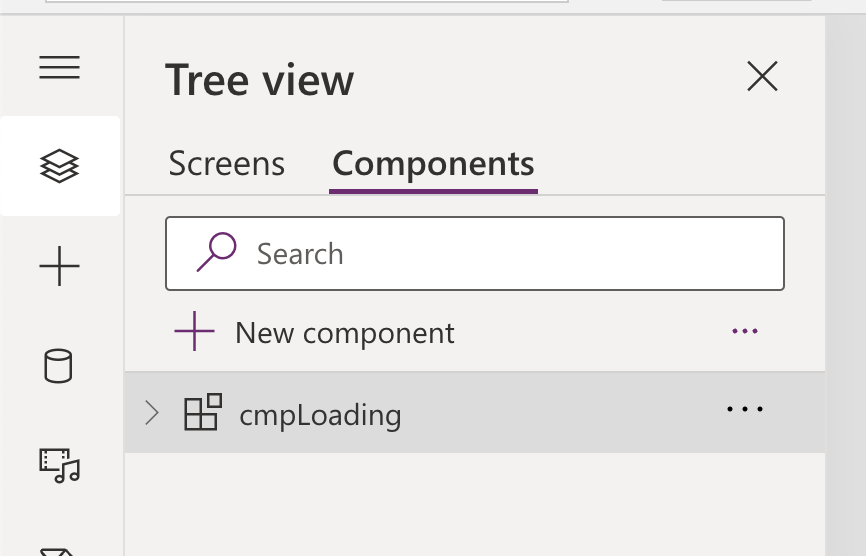
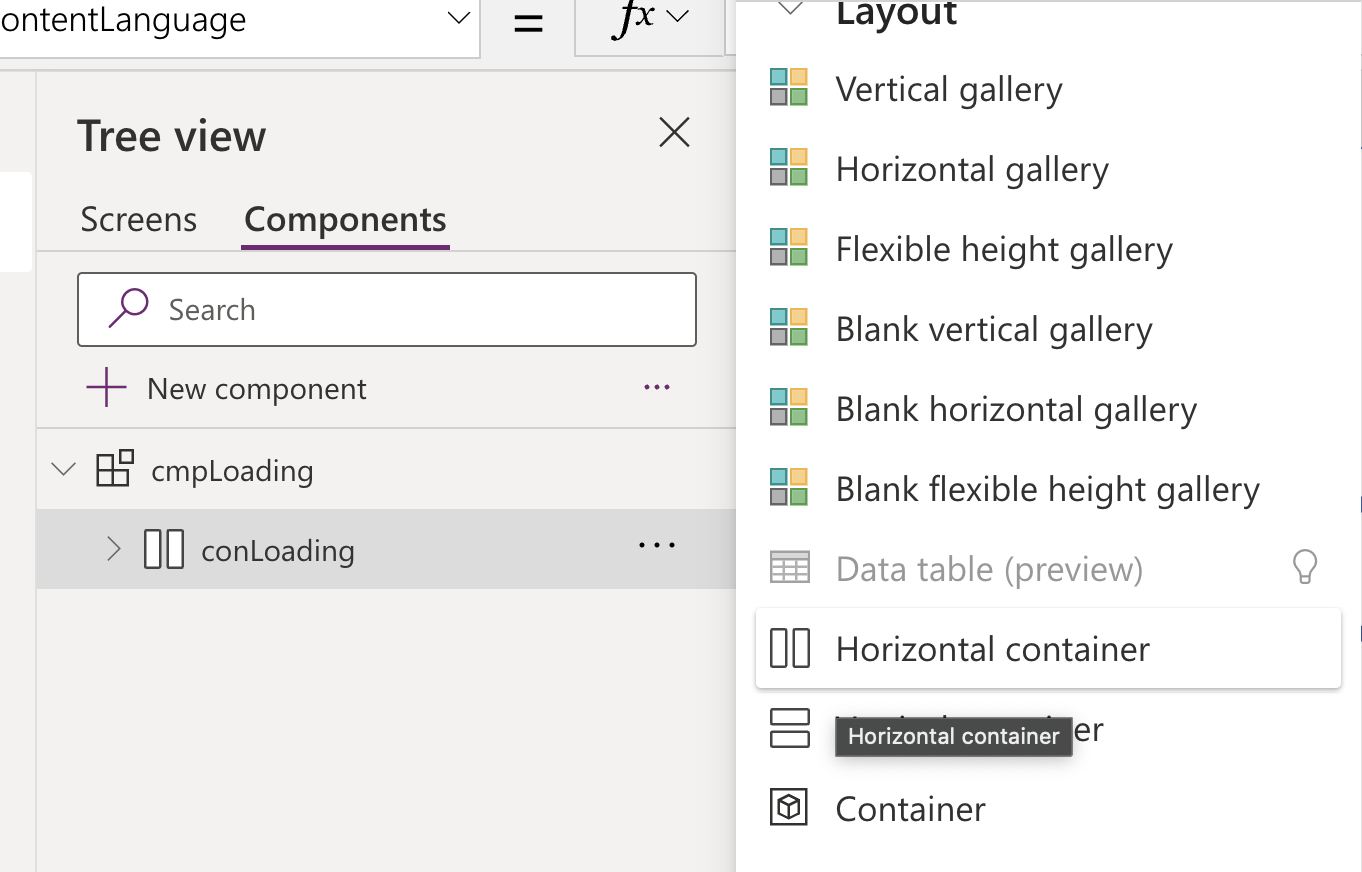
Once you're in your app, go to the Tree View, click on Components, and then create a new component.
Insert a Horizontal Container
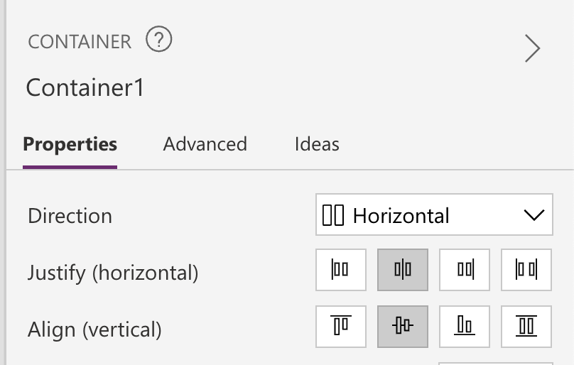
Set X and Y positions to 0, the Width of the container to Parent.Width and the Height to Parent.Height. This will ensure the loading overlay takes up all of the space available on the screen.
Change the Justify (horizontal) and Align (vertical) properties of the container to center. This will ensure the loading spinner and text are aligned in the middle of the screen.
Toggle Wrap to On, or set the formula to true. This will ensure that the text wraps below the image.
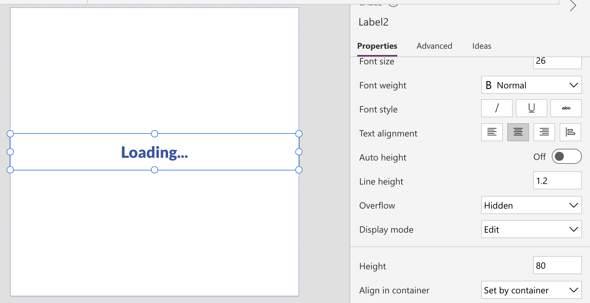
Creating the text label
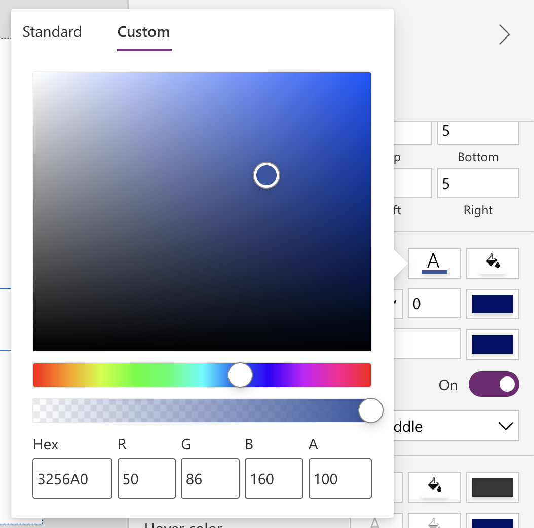
Insert a Text Label inside the container and set the text to "Loading...". Change the font to Lato Black and the size to 26. Change the color to #3256A0.
Set the height of the text label to 80, set the width to Parent.Width, and align the text in the center.
You should now have something that looks like this:
Creating the image
Grab some code for an animated SVG from somewhere or copy my code below:
<svg class="loading-spinner" viewBox="0 0 100 100" xmlns="http://www.w3.org/2000/svg">
    <defs>
        <linearGradient id="MyGradient">
            <stop offset="5%" stop-color="#3256A0" />
            <stop offset="95%" stop-color="#3b71e2" />
        </linearGradient>
    </defs>
    <style>
        .loading-spinner {
            animation: 2s linear infinite svg-animation;
            max-width: 100px;
        }
        @keyframes svg-animation {
            0% {
                transform: rotateZ(0deg);
            }
            100% {
                transform: rotateZ(360deg)
            }
        }
        .circle {
            animation: 1.4s ease-in-out infinite both circle-animation;
            display: block;
            fill: transparent;
            stroke: url(#MyGradient);
            stroke-linecap: round;
            stroke-dasharray: 283;
            stroke-dashoffset: 280;
            stroke-width: 10px;
            transform-origin: 50% 50%;
        }

        @keyframes circle-animation {
            0%,
            25% {
                stroke-dashoffset: 280;
                transform: rotate(0);
            }

            50%,
            75% {
                stroke-dashoffset: 75;
                transform: rotate(45deg);
            }

            100% {
                stroke-dashoffset: 280;
                transform: rotate(360deg);
            }
        }
    </style>
    <circle class="circle" cx="50" cy="50" r="45"/>
</svg>
Paste that code into my converter to get the Power Apps friendly code.
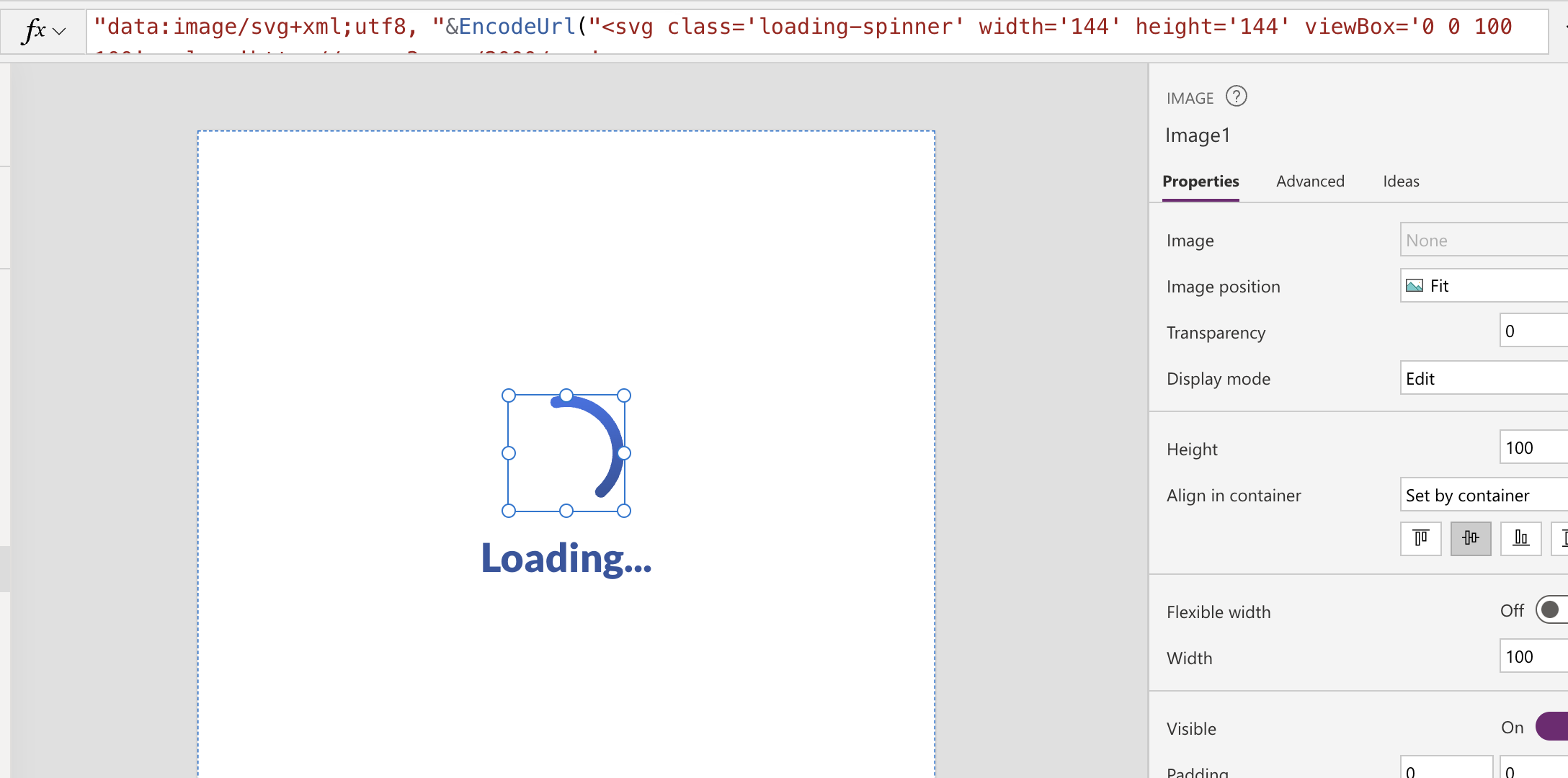
Back in Power Apps, insert an image inside your container and paste the code inside the Image property.
Reorder the image control to move it above the text label. You can do this by selecting the image control and then pressing Ctrl + [ on your keyboard. It's cmd + [ for Mac users.
You should now something that looks like this (with the image being animated):
Finishing touches
In order to make the loading component more visible, and to take focus away from the details in the background, we're going to add a 50% opaque background to our component.
Click on your component and go to the Fill property.
Change this to RGBA(255, 255, 255, 50%). The abbreviation represents Red, Green, Blue and Alpha.
We're setting red, green and blue to 255, which is the highest value. This will make the colour white.
We're then setting the alpha channel to 50%, which is essentially telling it to be 50% visible. In other words, 50% opaque/transparent.
Now our component looks great, let's make it usable!
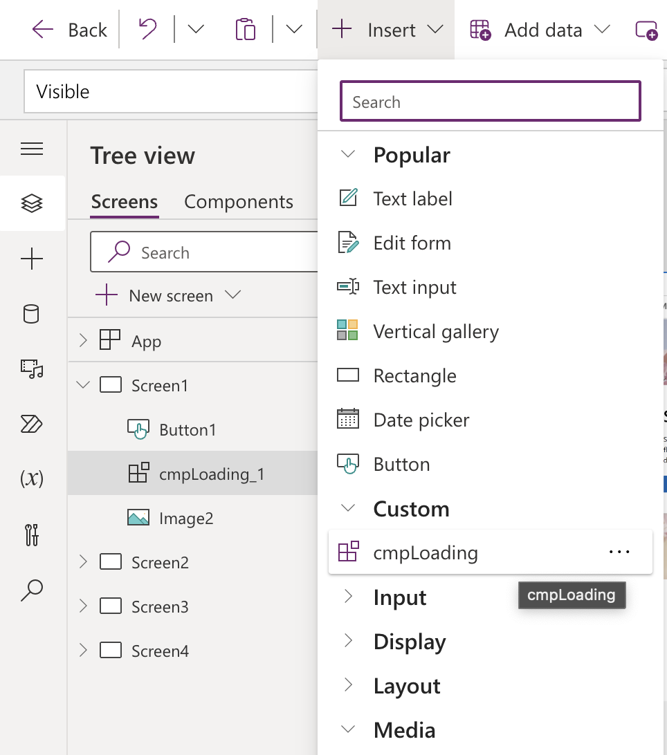
Go to your Screens and insert your newly-made component. You'll find it under 'Custom'.
Click on your component and change the Width to App.Width or Parent.Width and the Height to App.Height or Parent.Height.
It doesn't matter which as they're both referring to the size of the screen.
And make sure the X and Y properties are set to 0 so the component is aligned from the top left corner.
Toggling the visibility
Click on App in the Tree View and go to the OnStart property. In there, you want to set the loading status to true at the start, process anything else you have to do, and then set the loading to false, because everything is ready.
// Show the loading spinner as we need to process some things
Set(gblLoading, true);

// Your other code goes here

// Hide the loading spinner as everything is ready
Set(gblLoading, false);
You can use this same concept in the OnVisible property for each of your screens where you need to do some processing. And every button that is clicked and will process something should have it.
Now you just need to add the new variable to your component, so the visibility changes.
Click on your component and change the Visibility property to gblLoading.
That's it! I hope you enjoyed this article. Feel free to reach out to me on LinkedIn if you have any comments or questions.
Comments