Animated text in Power Apps
Table of contents
Introduction
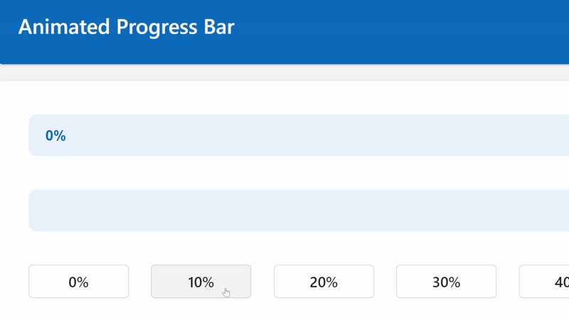
This is part 2 in our mini-series about how to create an awesome progress bar in Power Apps. See here for part 1, Animated progress bar in Power Apps.
Our text is going to change from the old percentage to the new one, move into the right place, and even change colour in order to provide the right colour contrast with its background. That's quite a bit to do, but this knowledge is so powerful as it can be applied to any SVG.
Adding text to an SVG
Let's get our text in the SVG first, then we can style it and animate it. As we're unable to morph the text from one string to another, we're going to have 2 strings and fade the visibility between them.
<text class='old-text{locRefreshSVG}' x='0' y='25'>{locPercentageStart}%</text>
<text class='new-text{locRefreshSVG}' x='0' y='25'>{locPercentageEnd}%</text>
The <text> tag writes text into our SVG. We're applying some classes to them so that we can animate them in future steps,
including using our timestamp variable from part 1 so that the SVG updates.
We're setting the x (horizontal) axis to zero, because we're going to manage this with our CSS styling, and we're setting the y axis to 25, as this is going to centre our text vertically. You will want to change this if you're going to use different font settings.
Finally, we're displaying the percentage start variable in the first text element, and the percentage end variable in second text element.
Setting the font
In our style tag, let's put the following CSS.
.old-text{locRefreshSVG}, .new-text{locRefreshSVG} {{
    font-family: sans-serif;
    font-size: 14px;
    font-weight: 550;
    text-align: right;
    animation-duration: 500ms;
    animation-fill-mode: forwards;
}}
We're applying this to both of the text elements, as shown in the first line.
The font parts are just setting some straight-forward styling to the text.
text-align: right; is going to ensure we can always expect the text at a certain distance from the right-hand side,
which is vital as we're aligning it to the right.
Finally, we're setting the animation duration and fill mode here. The duration is how long the animation will run for, of course. The fill mode tells the SVG to animate from the beginning to the end and then retain that last keyframe. Essentially, don't go back to the beginning of the animation.
At this stage our text still looks bad as we have one elements on top of the other, so let's animate them to fix that.
Animating the starting percentage text
It's quite a big chunk of code for animating the text, but it's not as intimidating as it looks.
Let's take it step by step. This all goes in the <style> tag as it's CSS.
.old-text{locRefreshSVG} {{
    animation-name: oldtext{locRefreshSVG};
}}
In the above code we're telling the old-text class what the animation name is, so that it knows which keyframes to use.
@keyframes oldtext{locRefreshSVG} {{
    0% {{
        fill: {If(locPercentageStart < 2, Substitute(JSON(App.Theme.Colors.Primary),"""", ""), Substitute(JSON(App.Theme.Colors.Lighter80),"""", ""))};
        opacity: 100%;
        transform: translateX({Min(Self.Width - 47, Max(16, (Self.Width / 100 * locPercentageStart) - 40))}px);
    }}
    100% {{
        fill: {If(locPercentageEnd < 2, Substitute(JSON(App.Theme.Colors.Primary),"""", ""), Substitute(JSON(App.Theme.Colors.Lighter80),"""", ""))};
        opacity: 0%;
        transform: translateX({Min(Self.Width - 47, Max(16, (Self.Width / 100 * locPercentageEnd) - 40))}px);
    }}
}}
This is the code that performs the animation. We're telling it that at 0%:
- we want the fill to be the primary colour from the theme if the percentage is less than 2, otherwise we want to use a light colour from the theme because the background will be dark
- we want to see the text,
opacity: 100%; - we are performing a calculation to see how far along the x (horizontal) axis the text should be
The x axis calculation
transform: translateX() will tell the SVG at which pixel to render the text along the x axis.
Our main code for calculating that is (Self.Width / 100 * locPercentageStart), which will find the percentage of the width.
For example, with a 100 pixel width, 40% would be 40 pixels. Speaking of 40 pixels, we remove that from the figure so that it's not flush
against the right-hand side. We're essentially giving it some padding.
We then perform a Max(16, OurNumber) function on the number, to ensure that the x axis does not go below 16, as we need to ensure
we have some padding from the left. This function will choose the highest number of the two.
We then perform a Min(Self.Width - 47, OurNumber) on the result of that in order to ensure that the text contracts by 7 pixels when
it's at 100%, as we have an extra digit. This function will choose the lowest number of the two, ensuring we're never within 47 pixels
of the full width of the image / progress bar.
Animating the ending percentage text
This code is very similar to the starting percentage, except we're going from invisible to visible.
.new-text{locRefreshSVG} {{
    animation-name: newtext{locRefreshSVG};
}}
@keyframes newtext{locRefreshSVG} {{
    0% {{
        fill: {If(locPercentageStart < 2, Substitute(JSON(App.Theme.Colors.Primary),"""", ""), Substitute(JSON(App.Theme.Colors.Lighter80),"""", ""))};
        opacity: 0%;
        transform: translateX({Min(Self.Width - 47, Max(16, (Self.Width / 100 * locPercentageStart) - 40))}px);
    }}
    100% {{
        fill: {If(locPercentageEnd < 2, Substitute(JSON(App.Theme.Colors.Primary),"""", ""), Substitute(JSON(App.Theme.Colors.Lighter80),"""", ""))};
        opacity: 100%;
        transform: translateX({Min(Self.Width - 47, Max(16, (Self.Width / 100 * locPercentageEnd) - 40))}px);
    }}
}}
And that's it! You should now have an awesome animated progress bar and the knowledge to start creating your own animated SVGs. I'd love to see what you create.
All of the code
Here's what you should have in the OnVisible of your screen:
UpdateContext({ locRefreshSVG: Text(Now(), ""), locPercentageStart: 0, locPercentageEnd: 0 });Here's all of the code you should have in your image control:
"data:image/svg+xml;utf8, "&EncodeUrl($"
<svg width='{Self.Width}' height='{Self.Height}' version='1.1' xmlns='http://www.w3.org/2000/svg'>
    <style>
        .old-text{locRefreshSVG}, .new-text{locRefreshSVG} {{
            font-family: sans-serif;
            font-size: 14px;
            font-weight: 550;
            text-align: right;
            animation-duration: 500ms;
            animation-fill-mode: forwards;
        }}
        .old-text{locRefreshSVG} {{
            animation-name: oldtext{locRefreshSVG};
        }}
        @keyframes oldtext{locRefreshSVG} {{
            0% {{
                fill: {If(locPercentageStart < 2, Substitute(JSON(App.Theme.Colors.Primary),"""", ""), Substitute(JSON(App.Theme.Colors.Lighter80),"""", ""))};
                opacity: 100%;
                transform: translateX({Min(Self.Width - 47, Max(16, (Self.Width / 100 * locPercentageStart) - 40))}px);
            }}
            100% {{
                fill: {If(locPercentageEnd < 2, Substitute(JSON(App.Theme.Colors.Primary),"""", ""), Substitute(JSON(App.Theme.Colors.Lighter80),"""", ""))};
                opacity: 0%;
                transform: translateX({Min(Self.Width - 47, Max(16, (Self.Width / 100 * locPercentageEnd) - 40))}px);
            }}
        }}
        .new-text{locRefreshSVG} {{
            animation-name: newtext{locRefreshSVG};
        }}
        @keyframes newtext{locRefreshSVG} {{
            0% {{
                fill: {If(locPercentageStart < 2, Substitute(JSON(App.Theme.Colors.Primary),"""", ""), Substitute(JSON(App.Theme.Colors.Lighter80),"""", ""))};
                opacity: 0%;
                transform: translateX({Min(Self.Width - 47, Max(16, (Self.Width / 100 * locPercentageStart) - 40))}px);
            }}
            100% {{
                fill: {If(locPercentageEnd < 2, Substitute(JSON(App.Theme.Colors.Primary),"""", ""), Substitute(JSON(App.Theme.Colors.Lighter80),"""", ""))};
                opacity: 100%;
                transform: translateX({Min(Self.Width - 47, Max(16, (Self.Width / 100 * locPercentageEnd) - 40))}px);
            }}
        }}
        .completion{locRefreshSVG} {{
            animation-name: progress{locRefreshSVG};
            animation-duration: 500ms;
            animation-fill-mode: forwards;
        }}
        @keyframes progress{locRefreshSVG} {{
            0% {{
                width: {locPercentageStart}%;
            }}
            100% {{
                width: {locPercentageEnd}%;
            }}
        }}
    </style>
    <rect x='0' y='0' rx='8' width='{Self.Width}' height='{Self.Height}' stroke='transparent' fill='{Substitute(JSON(App.Theme.Colors.Lighter80),"""", "")}' stroke-width='0' />
    <rect class='completion{locRefreshSVG}' x='0' y='0' rx='8' width='{Self.Width / 100 * locPercentageStart}' height='{Self.Height}' stroke='transparent' fill='{Substitute(JSON(App.Theme.Colors.Primary),"""", "")}' stroke-width='0' />
    <text class='old-text{locRefreshSVG}' x='0' y='25'>{locPercentageStart}%</text>
    <text class='new-text{locRefreshSVG}' x='0' y='25'>{locPercentageEnd}%</text>
</svg>
")
Here's how you update your progress bar (your new progress figure goes in locPercentageEnd):
UpdateContext({ locRefreshSVG: Text(Now(), ""), locPercentageStart: locPercentageEnd, locPercentageEnd: 50 });
Comments