Animated progress bar in Power Apps
Table of contents
Introduction
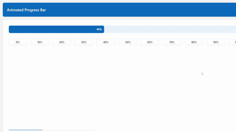
Here's what we're going to create:
Not only does it perform extremely well and look professional, but it will inherit from your Power Apps theme. Genius.
If you can't be bothered to read the article and just want to peek/grab the code, click here to scroll down.
Creating the background
In Power Apps Studio, insert an image, set the height to 40, and then we'll initially construct our SVG and rectangle for the progress bar background.
"data:image/svg+xml;utf8, "&EncodeUrl($"This code tells Power Apps to treat our code as an SVG, and the dollar sign before the quote is telling Power Apps we're going to use string interpolation inside the quotes. This means that we can run Power Fx inside the quotes by using curly brackets.
<svg width='{Self.Width}' height='{Self.Height}' version='1.1' xmlns='http://www.w3.org/2000/svg'>
    <rect x='0' y='0' rx='8' width='{Self.Width}' height='{Self.Height}' stroke='transparent' stroke-width='0' />
</svg>
")
This code is the beginning of our SVG. We're telling it to use the same width and height as the image control its contained within.
Then we're creating a rectangle that's the same size. The rx='8' refers to the radius of the corners, so we're making them slightly rounded.
You should now have a black rectangle in your image control. I told you we're going to inherit the colours from your theme, right?
Inside your rectangle, enter the following code:
fill='{Substitute(JSON(App.Theme.Colors.Lighter80),"""", "")}'This tells Power Apps to fill your rectangle with whatever is inside the single quotes.
App.Theme.Colors.Lighter80 refers to one of the colours from your theme. However, on it's own it's returning a Power Apps colour value,
which isn't understood by an SVG. In order to convert it, we first turn it into JSON format, which gives us "#ebf3fcff".
This is a hex code with alpha transparency, which is great for SVGs, but we need to strip out those quotes, which is why we're using the substitute function there.
Creating the bar that show's the progress
This bar is similar to the one above, but now we're starting to use variables. Somewhere in your app you need to set the starting percentage and ending percentage. If the progress has not been changed yet, this should be zero.
You also need to set a timestamp. In order to ensure the SVG refreshes each time we change the values, we need to link the CSS classes to a timestamp.
For example, in the OnVisible of your screen, you could put the following code:
UpdateContext({ locRefreshSVG: Text(Now(), ""), locPercentageStart: 0, locPercentageEnd: 0 });We're using the Now() function and Text() function in order to create our timestamp. This gives us the number of milliseconds since 01/01/1970.
Here's the code for our progress rectangle.
<rect class='completion{locRefreshSVG}' x='0' y='0' rx='8' width='{Self.Width / 100 * locPercentageStart}' height='{Self.Height}' stroke='transparent' fill='{Substitute(JSON(App.Theme.Colors.Primary),"""", "")}' stroke-width='0' />We're giving this rectangle a class, called completion, and appending our timestamp to it, so we can reference that class in order to animate the rectangle.
We're then setting the width to the percentage we want the animation to start at.
Finally, in our fill we're using the primary colour from our Power Apps theme.
Animating the bar
Here's where the magic happens. We animate SVGs using the <style> tag and using CSS keyframes.
    <style>
        .completion{locRefreshSVG} {{
            animation-name: progress{locRefreshSVG};
            animation-duration: 500ms;
            animation-fill-mode: forwards;
        }}
        @keyframes progress{locRefreshSVG} {{
            0% {{
                width: {locPercentageStart}%;
            }}
            100% {{
                width: {locPercentageEnd}%;
            }}
        }}
    </style>
This code is referring to our completion class and telling it to change the width from the value in the variable
locPercentageStart to the variable in locPercentageEnd.
All you need to do now is run the following code to change your progress bar:
UpdateContext({ locRefreshSVG: Text(Now(), ""), locPercentageStart: locPercentageEnd, locPercentageEnd: 50 });In the example above we're:
- updating our timestamp, to ensure the SVG recognises a change has been made
- setting the starting percentage to what the ending percentage was, so that the animation smoothly changes from what it used to be
- setting the ending percentage, so the animation knows where to end
Accessibility
If someone is using a screen reader, we want our progress bar to tell them the current progress, so set the AccessibleLabel property of the image to the following (or similar):
$"Current progress: {locPercentageEnd}%"Next up
Click here for part 2, where I show you to how to add animated text to the progress bar.
All of the code
Here's what you should have in the OnVisible of your screen:
UpdateContext({ locRefreshSVG: Text(Now(), ""), locPercentageStart: 0, locPercentageEnd: 0 });Here's all of the code you should have in your image control:
"data:image/svg+xml;utf8, "&EncodeUrl($"
<svg width='{Self.Width}' height='{Self.Height}' version='1.1' xmlns='http://www.w3.org/2000/svg'>
    <style>
        .completion{locRefreshSVG} {{
            animation-name: progress{locRefreshSVG};
            animation-duration: 500ms;
            animation-fill-mode: forwards;
        }}
        @keyframes progress{locRefreshSVG} {{
            0% {{
                width: {locPercentageStart}%;
            }}
            100% {{
                width: {locPercentageEnd}%;
            }}
        }}
    </style>
    <rect x='0' y='0' rx='8' width='{Self.Width}' height='{Self.Height}' stroke='transparent' fill='{Substitute(JSON(App.Theme.Colors.Lighter80),"""", "")}' stroke-width='0' />
    <rect class='completion{locRefreshSVG}' x='0' y='0' rx='8' width='{Self.Width / 100 * locPercentageStart}' height='{Self.Height}' stroke='transparent' fill='{Substitute(JSON(App.Theme.Colors.Primary),"""", "")}' stroke-width='0' />
</svg>
")
Here's how you update your progress bar (your new progress figure goes in locPercentageEnd):
UpdateContext({ locRefreshSVG: Text(Now(), ""), locPercentageStart: locPercentageEnd, locPercentageEnd: 50 });
Comments