5 HTML Control tricks in Power Apps
Table of contents
Gradients
I love gradients, so this trick is one I take advantage of whenever I need to create a bespoke design for an app.
For both the background and text gradients we're going to create full sized div elements inside our HTML control,
so let me show you how to do that first.
Insert an HTML Control into your canvas app, remove the default 5 pixel padding from it, and put the following code inside the HtmlText property:
$"<div style='width: {Self.Width}px; height: {Self.Height-1}px;'></div>"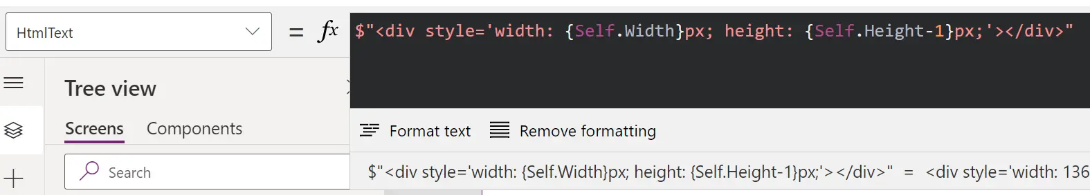
A div is used for sectioning content in HTML. The reason why we're removing 1 pixel from the height in the above code is because if we don't it will have a scrollbar inside the control. You can compensate for this by adding an extra pixel to the height of the control, so that you don't end up with a transparent 1 pixel line below it.
Background gradient
Now that we have our boilerplate code, let's add a gradient background to our div. Inside the style property of the div, add the following code:
background: radial-gradient(#004e92, #000428);This tells Power Apps to display a radial gradient from the first hex colour code to the second hex colour code, and it looks like this:
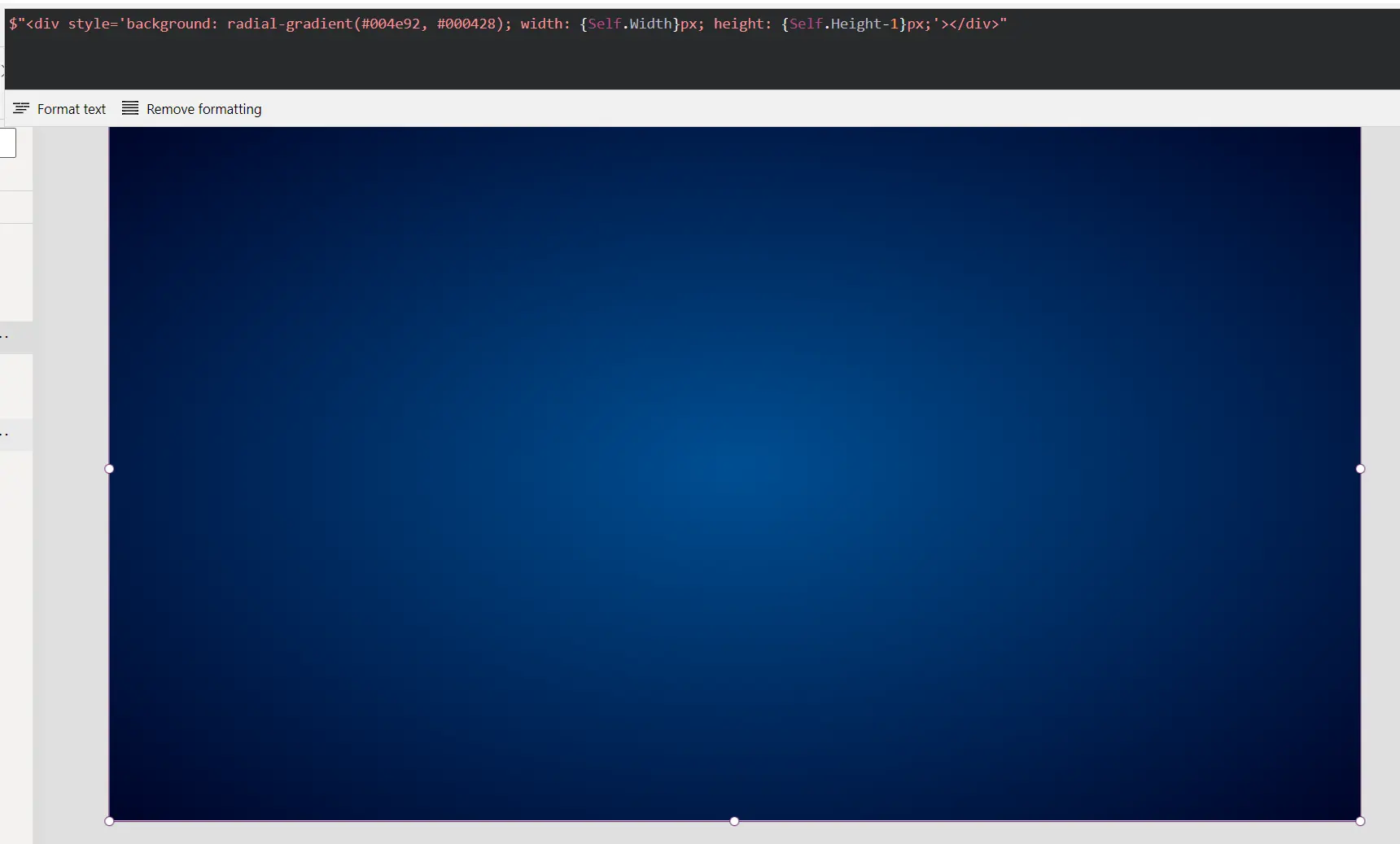
Our final code for the background gradient is as follows:
$"<div style='width: {Self.Width}px; height: {Self.Height-1}px; background: radial-gradient(#004e92, #000428);'></div>"There are 3 types of gradients you can use, and you can change their direction and number of colours, so there's lots of flexibility. You can read more on the W3Schools website.
Text gradient
When it comes to gradient text, the code is more verbose.
This is because of the method. We're setting a background gradient, but then telling the browser that gradient should only show where there is text.
This isn't supported by all browsers, so we add some fallbacks to try to combat that. This is why we have some instructions starting
with -webkit and some starting with -moz.
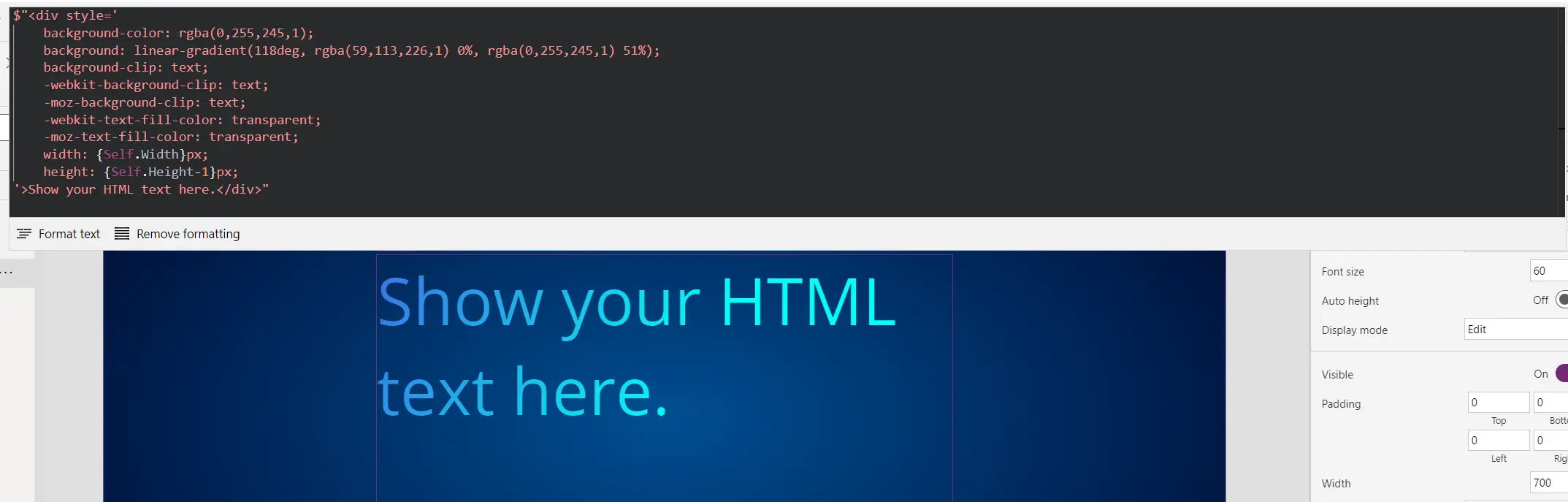
$"<div style='
    background-color: rgba(0,255,245,1);
    background: linear-gradient(118deg, rgba(59,113,226,1) 0%, rgba(0,255,245,1) 51%);
    background-clip: text;
    -webkit-background-clip: text;
    -moz-background-clip: text;
    -webkit-text-fill-color: transparent;
    -moz-text-fill-color: transparent;
    width: {Self.Width}px;
    height: {Self.Height-1}px;
'>Show your HTML text here.</div>"
I've set the font size in the HTML control to 60. Now it should look like this:
Centring HTML text
What about if we want to centre the text? Centring the text horizontally is easy; we can do that with text-align: center;.
But what about centring the text vertically?
Use vertical-align: middle;? Nope, that doesn't work.
Set the line height to the height of the control, like line-height: {Self.Height}px? It doesn't work if it spans more than one line.
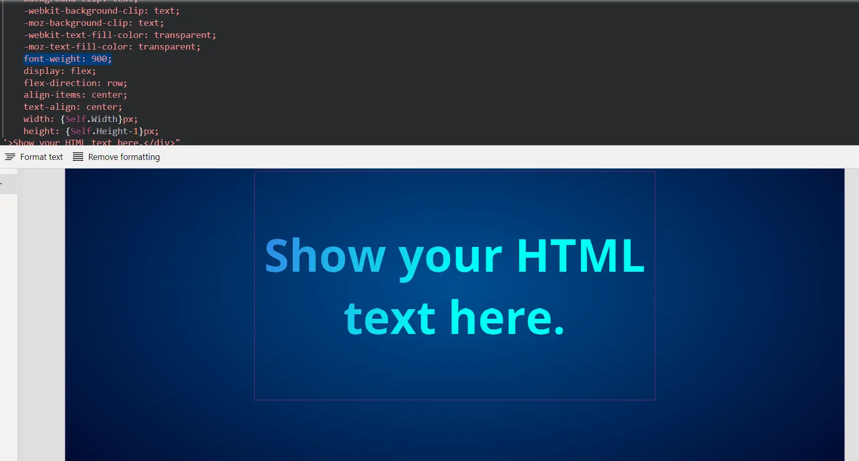
My recommendation is to use Flexbox (CSS Flexible Box), which is the modern way of arranging elements in a responsive manner.
display: flex;
flex-direction: row;
align-items: center;
This tells the browser to display the item using Flexbox, treat the contents as a row of items, and align those items in the (vertical) centre of the element. If you want to learn more about Flexbox, I think this CSS Tricks page is awesome.
I decided to also make the font bold. Here's our full code:
$"<div style='
    background-color: rgba(0,255,245,1);
    background: linear-gradient(118deg, rgba(59,113,226,1) 0%, rgba(0,255,245,1) 51%);
    background-clip: text;
    -webkit-background-clip: text;
    -moz-background-clip: text;
    -webkit-text-fill-color: transparent;
    -moz-text-fill-color: transparent;
    font-weight: 900;
    display: flex;
    flex-direction: row;
    align-items: center;
    text-align: center;
    width: {Self.Width}px;
    height: {Self.Height-1}px;
'>Show your HTML text here.</div>"
And here's our centred text:
HTML lists
If you were thinking of display a list of items in a canvas app you'd probably think to use the Gallery control, right? That's absolutely fine, but, if the list doesn't need to be clickable, you might want to consider the an unordered or ordered list element. these will only be classed as one control, instead of the gallery needing multiple.
Inside of your HTML control, you would use the following code:
"<ol>
    <li>List Item 1</li>
    <li>List Item 2</li>
</ol>"
And how would you add your table/collection of data to the list? Like so:
$"<ol>
    {Concat( FirstN(Accounts, 5), $"<li>{ThisRecord.'Account Name'}</li>" )}
</ol>"
This is telling Power Fx to concatenate our data into a single string, and we're using the Account Name inside of that string from each item (ThisRecord). Pretty cool huh?
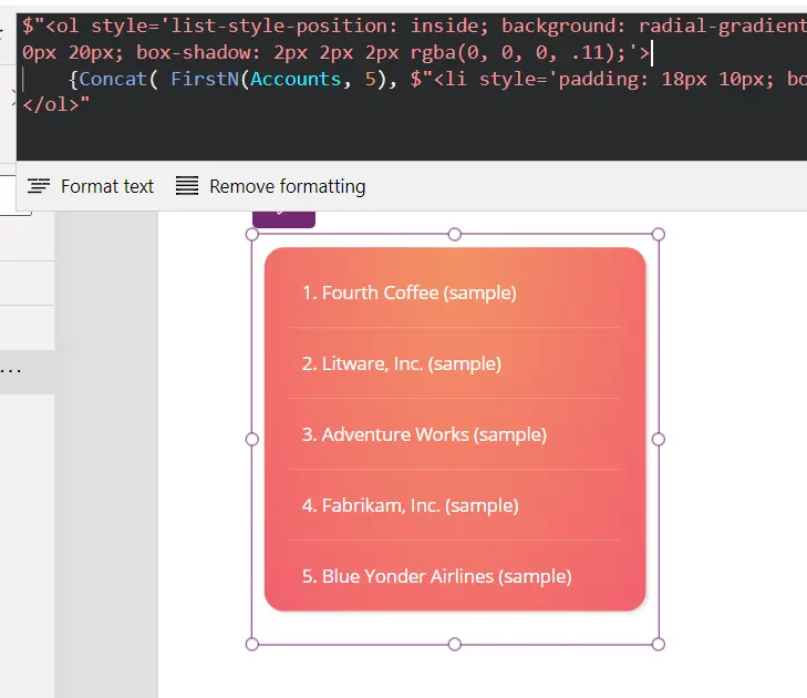
Now let's style our list so that it looks awesome.
$"<ol style='list-style-position: inside; background: radial-gradient(ellipse farthest-corner at center top, #f39264 0%, #f2606f 100%); color: #fff; border-radius: 16px; margin: 10px; padding: 8px 20px 0px 20px; box-shadow: 2px 2px 2px rgba(0, 0, 0, .11);'>
    {Concat( FirstN(Accounts, 5), $"<li style='padding: 18px 10px; border-bottom: 1px solid rgba(255, 255, 255, 0.2);'>{ThisRecord.'Account Name'}</li>" )}
</ol>"
And we're left with this awesome-looking list in our app:
Note: If you wanted to make the items clickable, add hover effects, etc. then you'd really want to create a PCF component for this.
CSS blur
This is a very simple CSS effect that can help to make the text on top of it more readable, or you could simply use it for styling like in Glassmorphism design.
All you have to do is add backdrop-filter: blur(10px); to your style tag, with the quantity of blurring radius of your choice.
We're using pixels here, but you could use rem (related to the font size of the root element) if you prefer.
A background blur gives us the ability to make really nice designs like the one below:
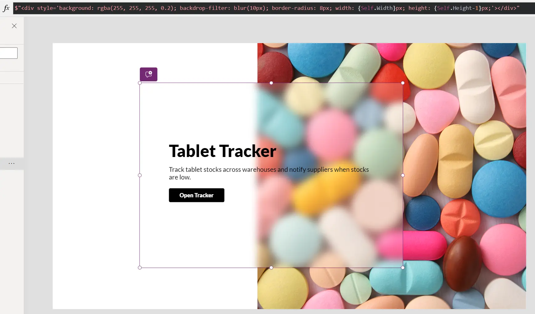
Here's the full code to make the blurred box on top of the image.
$"<div style='background: rgba(255, 255, 255, 0.2); backdrop-filter: blur(10px); border-radius: 8px; width: {Self.Width}px; height: {Self.Height-1}px;'></div>"Displaying WebP images
My final tip is a way to display extremely well optimised images, including animation and transparency, in Power Apps. This image format is called WebP. Krzysztof 🅱️orkowski reminded me of this one, so a shout out to him!
Power Apps does not allow the upload of WebP images, and they're far superior to JPGs, PNGs and GIFs. We can display them inline, which I demonstrated in my previous blog post, but we can also link to them via the HTML control, if they're already uploaded to the web. Here's how to do it:
"<img src='http://IMAGE-ADDRESS.webp' alt='Description of the image'>"Please ensure to add and populate the alt attribute, as this is what will show if the image fails to load, or, if accessing the app via a screen reader, this is what will be read out.
If you want to know more about WebP images, including how to create them, please refer to my blog post on it.
HTML Control Limitations
I think it's worthwhile for me to let you know what the limitations are, just in case you find HTML code on the Internet and can't understand why it doesn't work in your HTML control. Of course, you need to convert double quotes to single quotes as a first port of call, as you've seen in all of the code above, but what else is there to know?
You can't use CSS hover effects. You can't use any CSS selectors at all. You can only use inline CSS with the style tag. So this also means CSS animations are out of the question. This is part of the reason why you see me posting about SVG animations.
In addition to that, you can't use any JavaScript.
If you need to use any of the above features it's time to learn about PCF components.
Comments